“OOMI IS MORE THAN A GHOST KITCHEN. IT’S A BRAND BUILT FOR SPEED & FLAVOR. A MULTI BRAND ROCKET SHIP CONNECTING BIG FLAVOR WITH FAST LIVES. WE HELPED BUILD THE VISUAL DIRECTION, VISUAL VOICE, AND VISUAL SYSTEM BEHIND THE FUTURE OF THEIR DELIVERY ONLY FOOD.
THE CHALLENGE:
THE DELIVERY ONLY FOOD SPACE WAS EXPLODING, BUT IT WAS MESSY. FRAGMENTED BRANDS, WEAK STORYTELLING, AND NO REAL LOYALTY. OOMI KITCHEN HAD THE PRODUCT. WHAT IT NEEDED WAS PRESENCE.
THE INSIGHT:
WE SAW THAT SPEED WASN’T THE ONLY SELLING POINT, TRUST WAS. IN A CROWDED FIELD, BRAND TRUST NEEDED TO BE FELT INSTANTLY, BEFORE THE FOOD EVEN ARRIVED. PACKAGING WAS BRANDING. LANGUAGE WAS EVERYTHING. WE NEED TO BRING STRONG VISUAL PRESENCE THROUGHOUT.
THE EXECUTION:
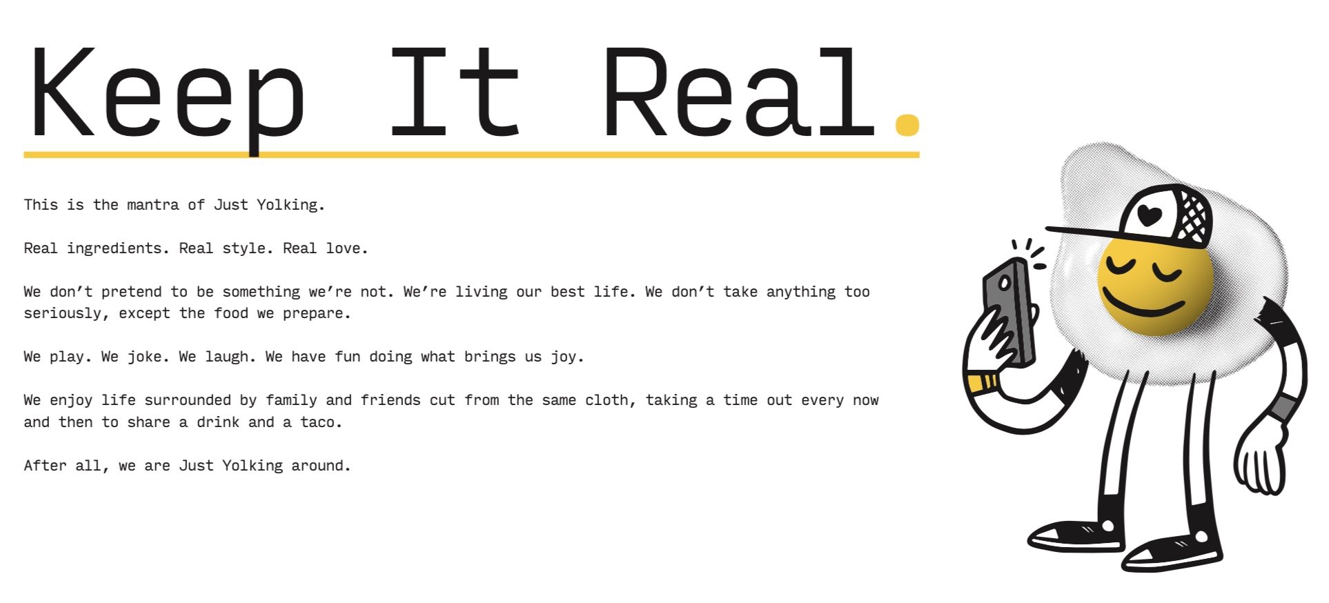
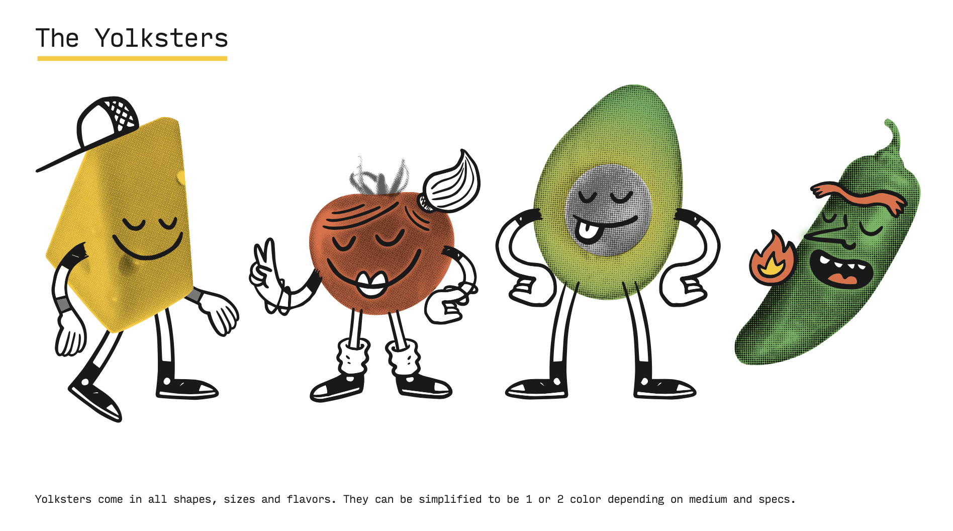
WE DEVELOPED A FULL STACK IDENTITY SYSTEM FOR JUST YOLKING. NAME, TONE, VISUAL DESIGN, PACKAGING, AND DIGITAL PRESENCE. IT HAD TO FLEX ACROSS MULTIPLE VIRTUAL CONCEPTS WHILE HOLDING TOGETHER UNDER ONE UMBRELLA. WE ALSO BUILT OUT THEIR OVERALL LOOK AND FEEL FOR THEIR MAINSTAY.
NAMING + BRAND ARCHITECTURE
IDENTITY SYSTEM + LOGOS
TONE OF VOICE DEVELOPMENT
BRAND PHOTOGRAPHY & ASSET DIRECTION
DELIVERY READY PACKAGING DESIGN
THE RESULT:
WITHIN THE FIRST 90 DAYS, OOMI LAUNCHED FIVE SUCCESSFUL FOOD BRANDS UNDER ONE ROOF. ORDERS EXCEEDED PROJECTIONS.
THE VISUAL SYSTEM BECAME INSTANTLY RECOGNIZABLE ALONG WITH SOCIAL CONTENT DEVELOPMENT IN THE LOCAL DELIVERY APP ECOSYSTEM.
OOMI BECAME SYNONYMOUS WITH SMART, FAST, AND FLAVORFUL IN DFW.
BEHIND THE SCENES NOTES:
WE WORKED DIRECTLY WITH MATT BRINKER (MAGNIFICENT BEARD) ON ILLUSTRATION + DESIGN DEVELOPMENT.
WE DESIGNED PACKAGING PROTOTYPES.
TONE WAS WORKSHOPPED ACROSS MULTIPLE FOOD PERSONAS, ALL UNIFIED BY A BIGGER BRAND ATTITUDE.
QUOTE:
“WILFREDO DIDN’T JUST GIVE US A LOGO, THEY GAVE US A LANGUAGE.” — OOMI FOUNDERS”
“Founded in 1995 on Dallas’ Lemmon Avenue, Hook Line & Sinker (HLS) has been serving Dallas residents for more than 25 years. The seafood shack inspired by those on the Gulf Coast offering fried catfish, shrimp, and oysters as well as grilled fish selections like salmon and rainbow trout, Hook Line & Sinker was managed by Del Sur Restaurant Group. Founded by Markus Pineyro and John E. Tuma, Del Sur combined the passions of both Dallas restaurateurs and their brands.
The Challenge:
Hook Line & Sinker wasn’t new to the game, they were the game. But 28 years in, their story had gone a little quiet. There was no strong digital presence. No content strategy. No updated visual identity. It needed a revival, not a rebrand, something true to its DNA.
The Insight:
What makes a place stick around for nearly three decades isn’t marketing, it’s memory. Our job wasn’t to reinvent HLS, it was to reflect what people already loved about it, and amplify it with just enough edge to bring in the next generation.
The Execution:
We dove into the archive. We sat in the booths. We ate the catfish. Then we built a content forward strategy that mixed nostalgia with flavor. We created a voice that felt like the servers: casual, sharp, always ready with a one liner. Then we wrapped it all in a style system that looked weathered but worked across modern platforms.
Tone of Voice + Brand Copy System
Photography Direction (menu, behind the scenes, legacy moments)
Menu Styling + In-Store Signage
Website Content + Strategy
Meta + IG Ads
The Result:
In 90 days, Hook Line & Sinker’s digital footprint went from low traction to highly engaged. The new content brought old fans back and gave newcomers a reason to check it out. CTR on paid ads outperformed expectations. People reposted the content with pride. And the update didn’t erase the grit, it honored it.
Behind The Scenes Notes:
We kept the iconic green baskets in every shoot.
Used archival photos as overlays in digital posts. Even let some of their staff help pick the taglines. Most of them hit harder than most agency copy.
Quote:
“It still feels like the old Hook. Just louder. Just clearer. Just right.” — Longtime Customer
Got a story that hasn’t been told yet? We’re here to help you shape it.”
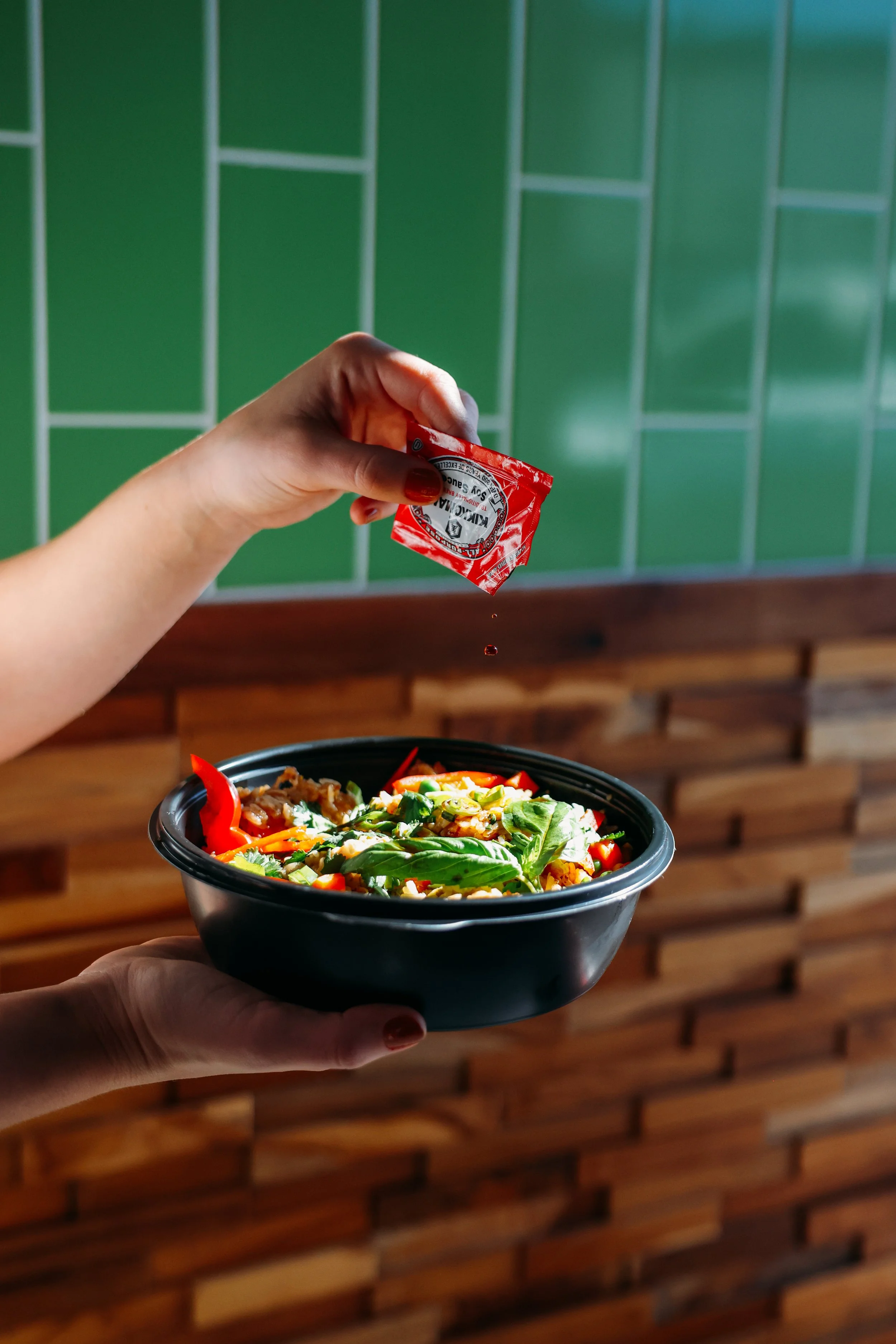
“Oomi Kitchen is a culinary hub that connects awesome food to customers seeking the next level of convenience! They’re located in the heart of Dallas, Tx.
Just Yolking, A Breakfast Concept That Doesn’t Hit Snooze, is one of many concepts they’ll have featured in their Ghost Kitchen, which is planned to open Fall of 2022. Had so much fun teaming up with Matt Brinker of Magnificent Beard for the naming, branding, and identity of this breakfast concept.
The Challenge:
Create an entirely new breakfast concept from scratch... inside a ghost kitchen, with no storefront, no signage, and no margin for visual confusion. It needed to be instantly craveable, light hearted but legit, and built to win the first meal of the day.
The Insight:
In a sea of sterile breakfast options, we saw a gap for humor, a reason to smile before you eat. The name had to disarm. The branding had to carry flavor. And it all needed to show up loud on a delivery app scroll.
The Execution:
We built Just Yolking as a full blown persona: cheeky, approachable, and visually unforgettable. The name came first, then the rest came easy. We collaborated with Matt Brinker (Magnificent Beard) to design a visual language that felt like a comic strip with culinary chops.
Naming + Brand Identity
Logo & Type System
Color Palette & Custom Icons
Packaging Design
Tone of Voice Development
The Goal:
Just Yolking will be launched with high memorability for immediate traction. To became the top ordered breakfast brand within its ghost kitchen in the first few months. Packaging posts to hit social without prompting. People remembering the name, and reordering because of the experience.
Behind The Scenes Notes:
We built in egg puns... and somehow made them work.
Created a tone of voice guide that reads like a brunch menu.
Field tested names with real users over breakfast meetings.
Quote:
“Not just eggs. Not just jokes. It’s an entire mood.” — Oomi Founders
Got a story that hasn’t been told yet? We’re here to help you shape it.”
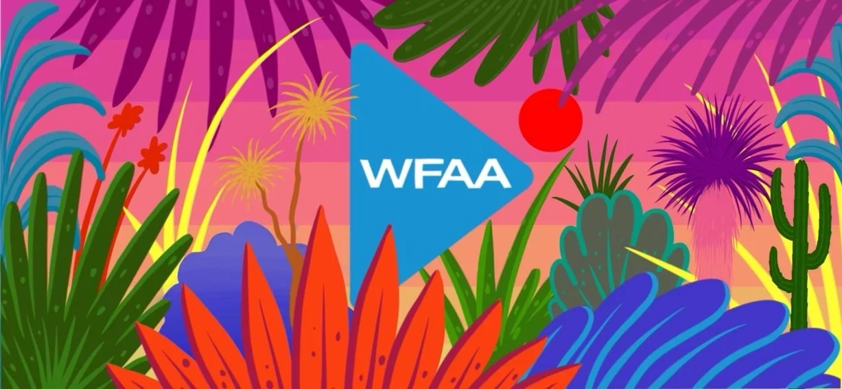
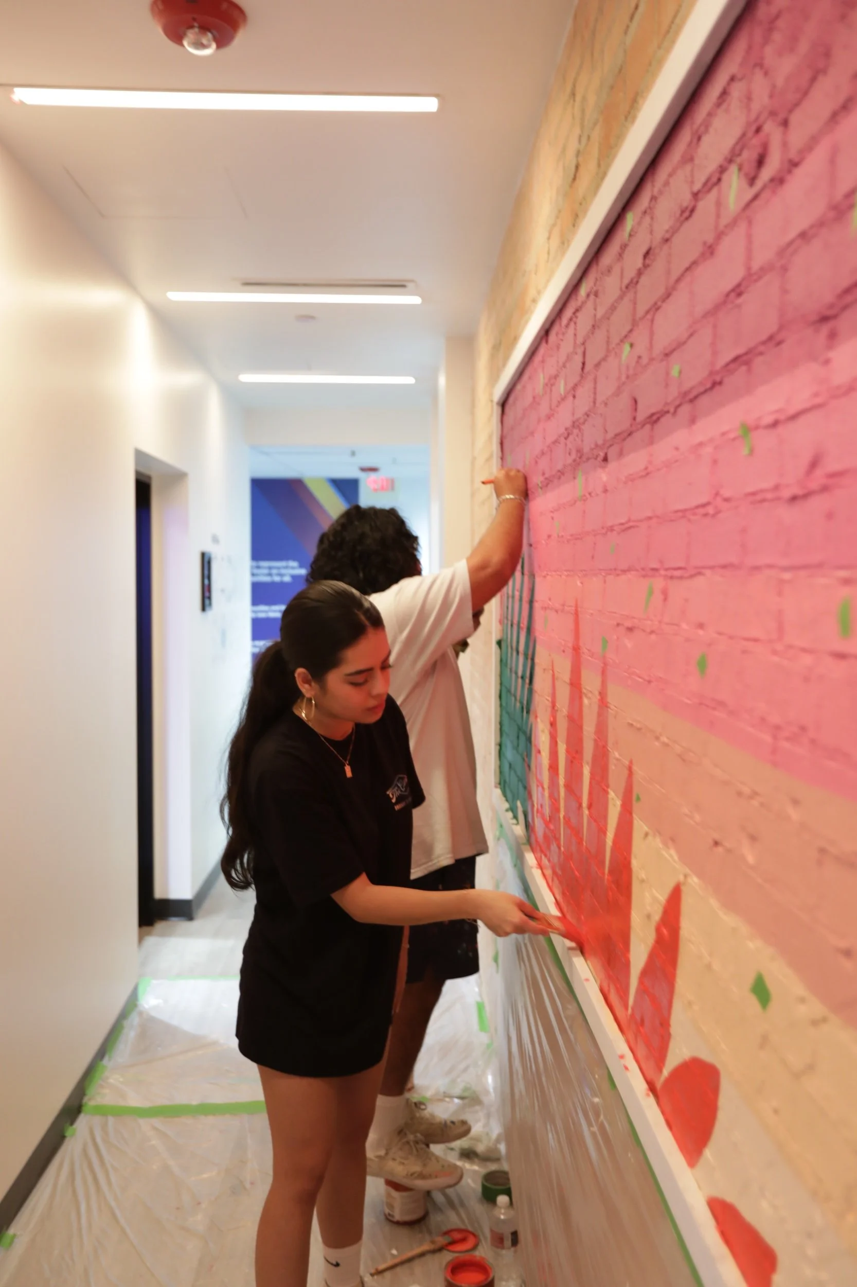
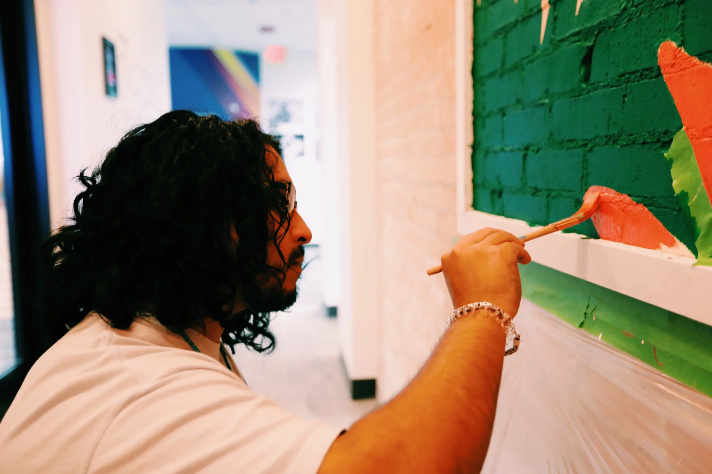
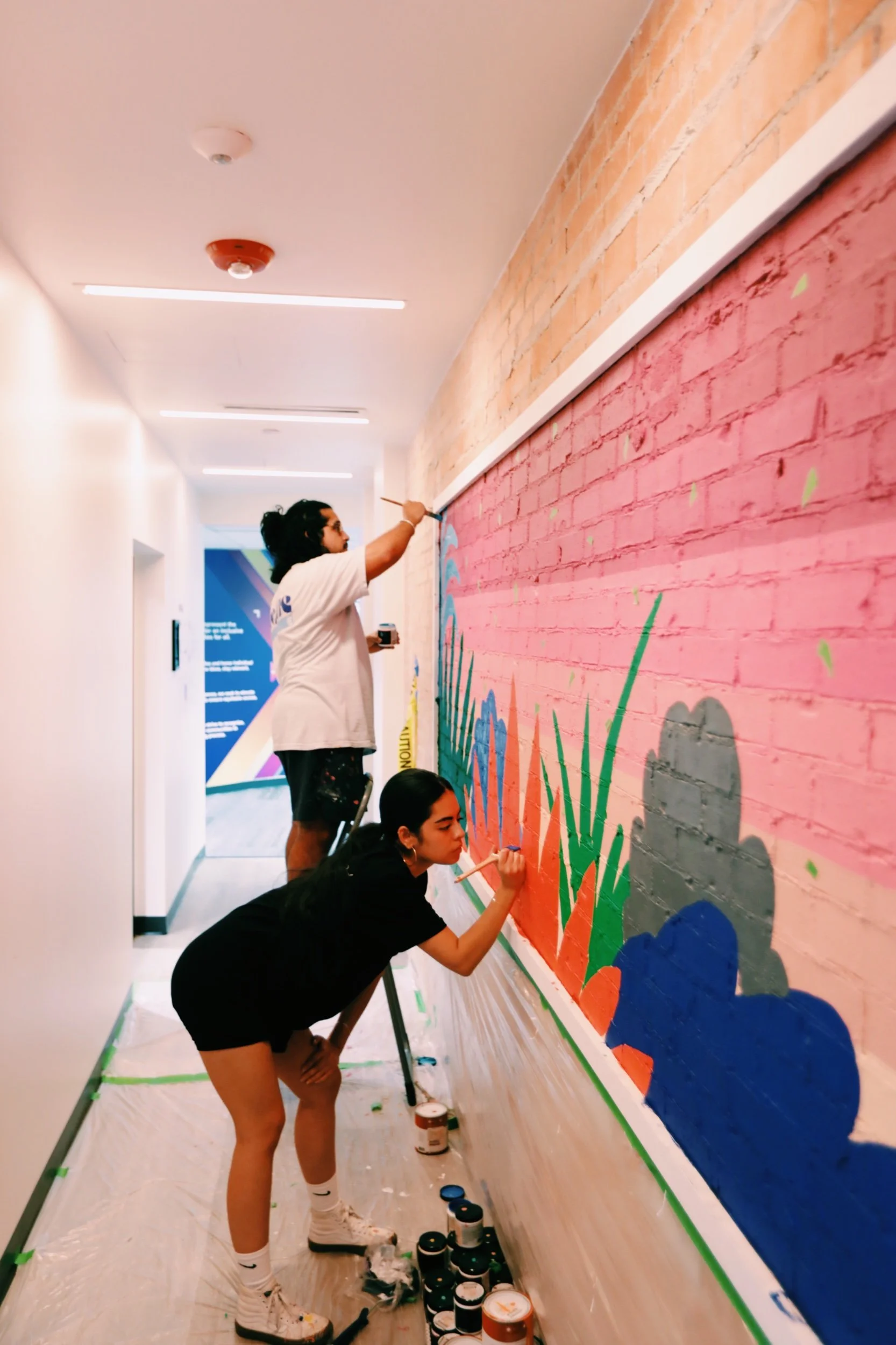
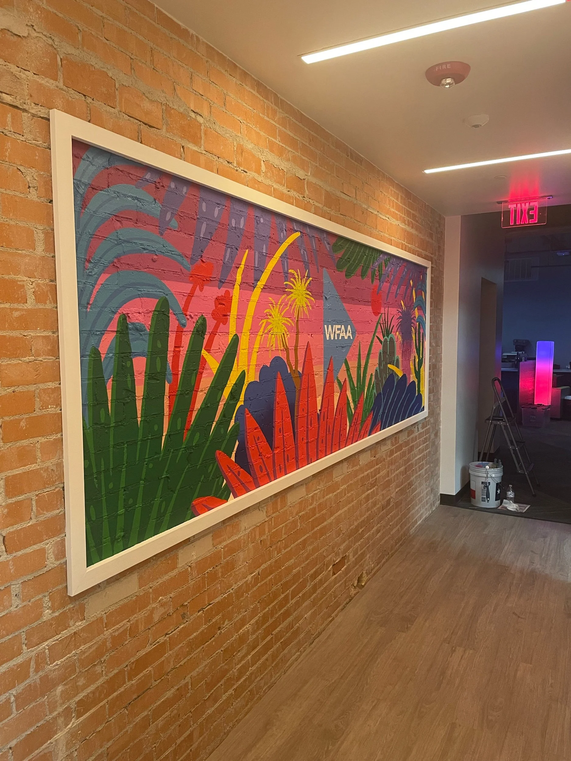
“Had the opportunity to collaborate with WFAA here in Dallas, Tx. They commissioned us to create a mural for their corporate headquarters located in Downtown.
Texas based artist & designer Drigo (Eric Rodriguez) produced the amazing design that was hand painted over the course of four days.
A Mural for Movement.
The Challenge:
WFAA wanted to make a bold visual statement in their downtown Dallas corporate headquarters. Something their staff could feel in their bones, even their traffic. They needed a mural that reflected the pulse of the city and their own commitment to community, movement, and story.
The Insight:
You can’t paint a mural that matters without tapping into something deeper than color. Drigo’s work speaks in symbolism, and WILFREDO’s job was to make sure the message landed across any audience, day or night shift.
The Execution:
We collaborated with Drigo from sketch to scaffold, managing visual direction, story alignment, and production cadence. Our team ensured the piece honored WFAA’s legacy while speaking in a fresh, modern visual language.
Creative Direction + Narrative Framing
Collaboration Management (Artist ↔ Client)
Production Oversight & Logistics
Photography + Press Kit Development
Documentation for WFAA’s owned media
The Result:
Unveiled in a high traffic hall wall that leads to their creative department, the mural received local press coverage and social engagement. WFAA integrated it into brand stories, community events, and will be on some on air features. Their staff doesn’t just pass it, they stop and take photos.
Behind The Scenes Notes:
Shot the installation process over 3 days in house.
Interviewed Drigo about visual symbology for internal brand use.
Color palette designed to hold up against feature fading over time.
Quote:
”The mural is a moving target, because the people are always moving. That’s WFAA, that’s Dallas.” — Drigo
Want art that means something? Let’s make it happen”
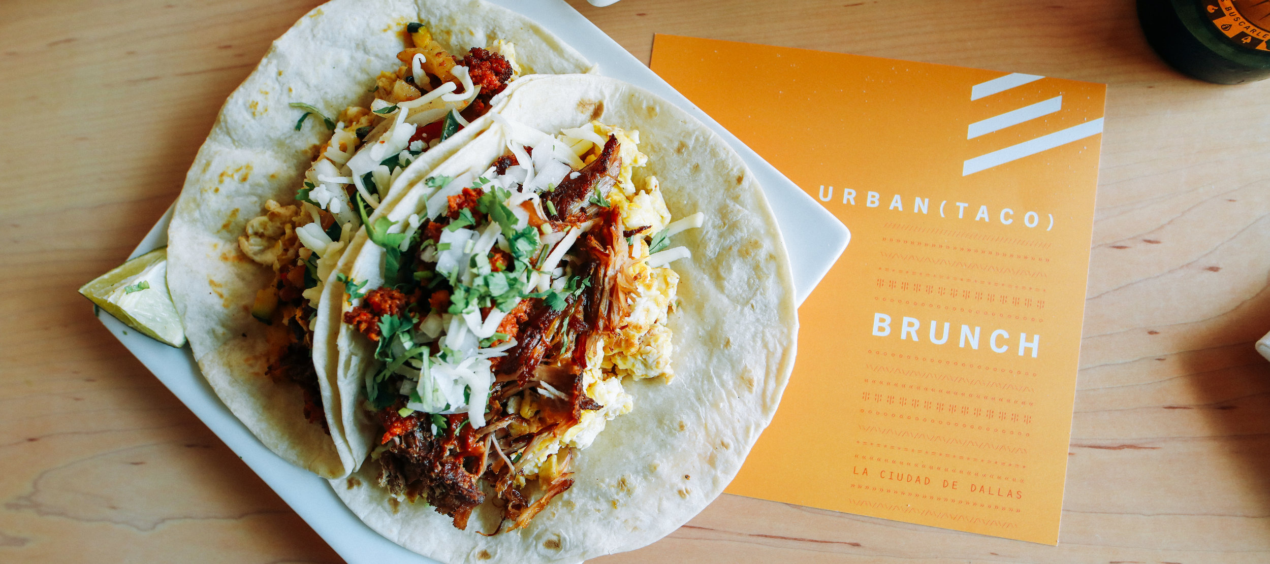
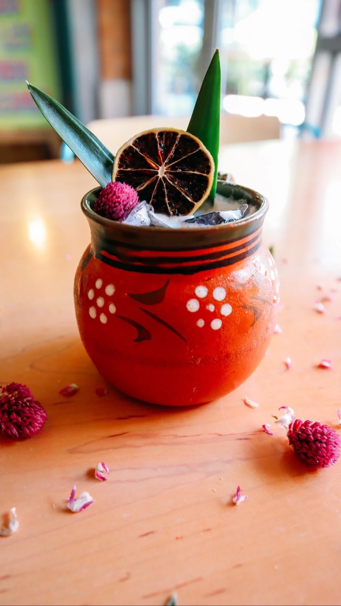
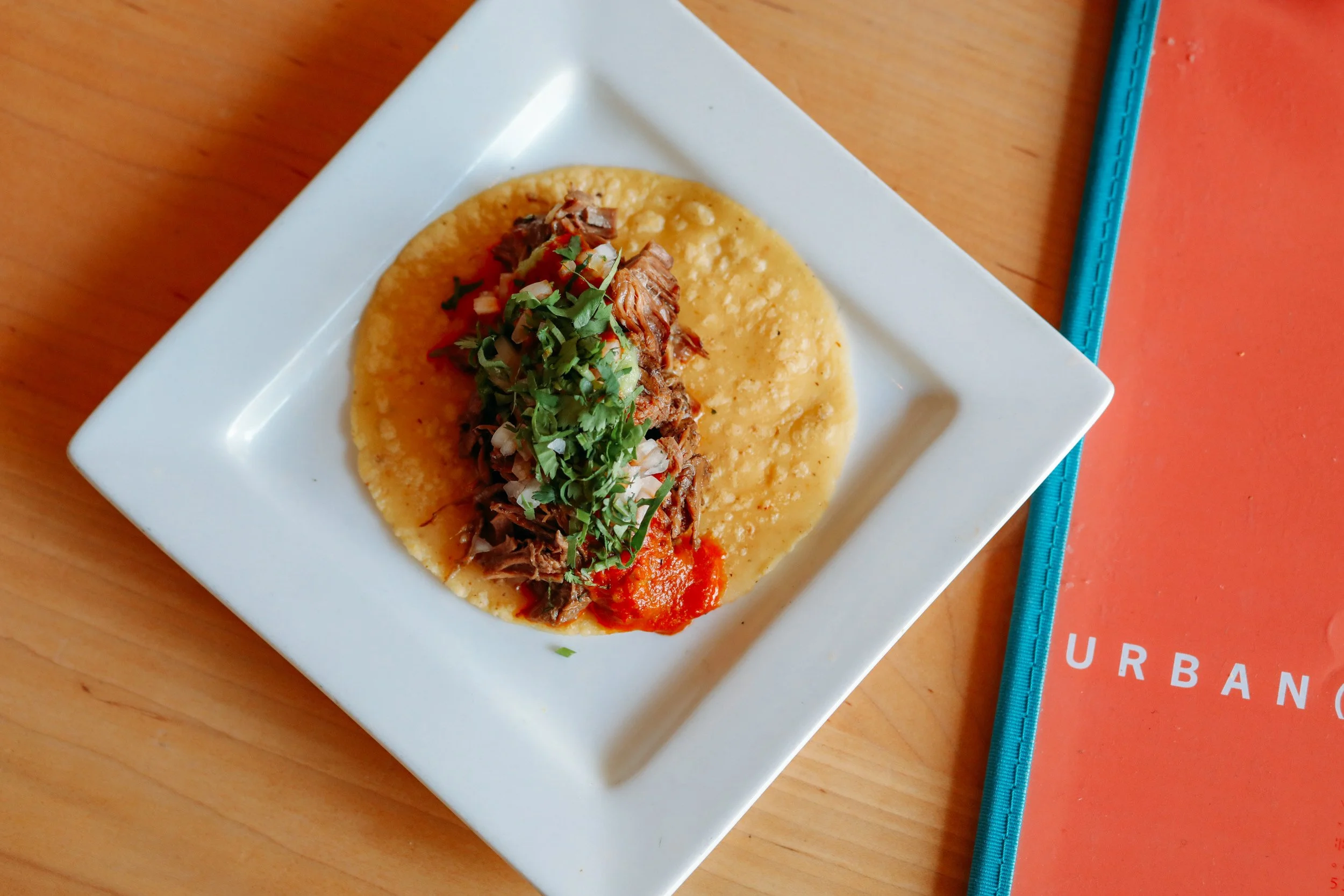
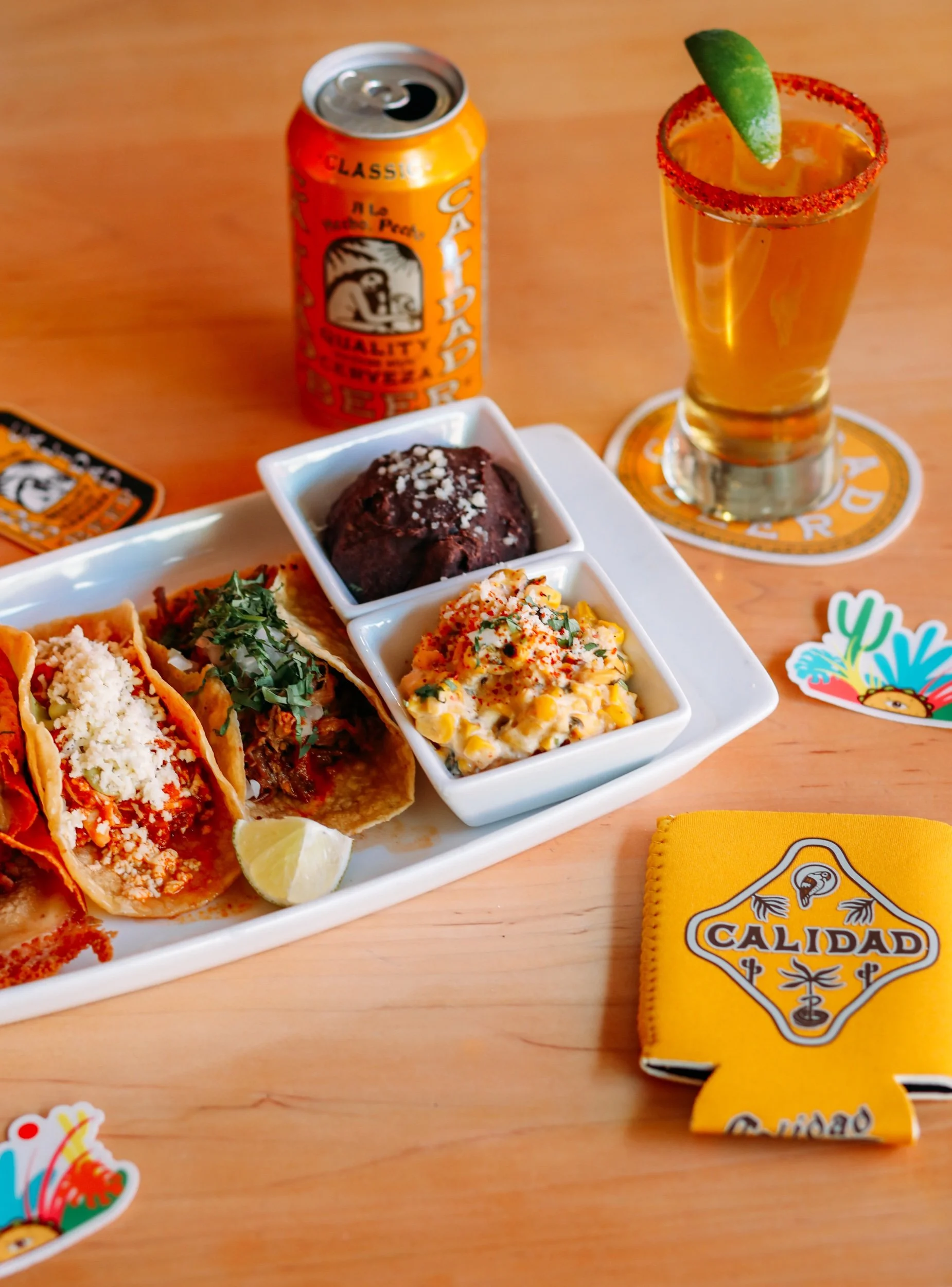
“Urban Taco features the traditional foods and distinctive flavors of Mexican taquerias by delivering a well-traveled menu of dishes that emulate the street foods and laid back eateries of native Mexico. The idea behind our menu evolution is to continue to showcase the diversity of Mexican ingredients by elevating classic cuisine in a contemporary, yet authentic way. At the heart of the Urban Taco menu is the dedication to serving fresh, authentic ingredients with everything made from scratch - from salsas and sauces to marinades spices and rubs. The restaurants offer a large selection of boutique tequilas from Mexico, Mexican beers, and an assortment of tasty sangrias.
A Rebrand You Can Taste.
The Challenge:
Urban Taco had heart, flavor, and history, but its brand voice hadn’t kept pace with its kitchen. It was time to bridge the old love with new relevance. To modernize without losing culture.
The Insight:
This wasn’t about trend chasing, not for us. It was about tightening the story. People already loved the product. Our job was to make the visual and verbal identity reflect the same confidence as the recipes.
The Execution:
We led a brand overhaul from concept through execution. We shot every dish like editorial. We built a voice that felt bilingual in both tone and audience. And we turned social content into craveable storytelling, not just pretty plates.
Brand Voice + Messaging Framework
Food Photography + Social Assets
Menu Redesign + Copy
Tone Direction for In Store Experience
Live Events & Happenings
Strategy for Digital + Paid Campaigns
Meta, Google, + IG Ads
The Result:
Urban Taco saw a boost in digital orders and foot traffic following the relaunch of not just plates but also brand experiences. The brand gained consistency across platforms, and the content created during the rebrand now powers their social posts. Loyal fans stayed. New guests arrived curious, left full, and happy.
Behind The Scenes Notes:
We styled tacos with hand sourced ceramics for a heritage meets now vibe.
Developed a visual language grid to guide future content.
Voice lines were workshopped in both until they hit just right.
Quote:
“Urban never felt more like itself, a mexican modern taqueria and kitchen.” — Markus Pineyro
Is your brand saying what your food’s already screaming? Let’s talk.”
“Hookline is a chef-driven restaurant that specializes in “Gulf Coast Low County” cuisine served in a casually stylish and vibrant atmosphere with reasonable prices. A restaurant in the Del Sur Restaurant Group, Hookline is the full-service evolution of its 21-year-old sister restaurant, Hook Line & Sinker.
Seafood, Rewritten!
The Challenge:
When Hookline opened in 2017, it wasn’t trying to replicate Hook Line & Sinker. It was a reinvention, a modern, chef forward expression of Gulf Coast & Low Country seafood for a new Dallas audience. But by 2022, its identity had faded. The food still hit. The vibe still worked. But the brand voice was inconsistent, the content was flat, and the story wasn’t being told.
They didn’t need a reset, they needed a reframe
The Insight:
Hookline lives in a space few seafood restaurants do: casual polish. You can walk in for oysters and leave talking about the cocktail program. It’s not fine dining, but it’s close. We realized the brand wasn’t about nostalgia or grit. It was about confidence, detail, and making seafood feel new again.
So we leaned in.
The Execution:
We built a layered content strategy that highlighted the craft behind the food, the soul behind the ingredients, and the texture of the space. Every shot had to say, “this isn’t just seafood, this is seafood in its prime.”
We used light intentionally. We let the food shine. And we let the team speak, from Chef Aaron Nelson’s notes to front of house energy.
Visual Identity Tune-Up
Photography & Lighting Direction
Social Launch Content (Photo, Video, Grid, Ads)
Website Copy & Menu UX Pass
Meta + Google Ads Strategy
Seasonal Campaign Creative
The Result:
Hookline saw an immediate uptick in social engagement, with customer created content echoing our visual tone. Google Maps views and direction taps increased by 42% in the first 60 days post campaign. Paid ads generated high intent reservations and reintroduced Hookline to new Dallas diners who wanted quality without the stiffness of “fancy.” The space felt alive, digitally and in person.
Behind The Scenes Notes:
We shot during golden hour hours for full lighting control. Brought in real guests, regulars, and staff for all campaign visuals. Shot mostly handheld for warmth, no gimbals, no glide cams.
The food shots made and enhanced all the press.
Quote: ”This feels like how Hookline was always meant to look.” — Ricardo Alcala (GM), Hookline”
“If you’re going to buy a home in Dallas, Tx, there’s only one person you call.
Icela Fernandez and her team at Dwell Dallas Realtors.
Damn good people, damn good talent.
20 years serving clients here in the DFW real estate market. She’ll welcome you home.
A Walkthrough That Closed in 6 Days.
The Challenge:
We got the call from Icela Robles with zero runway. A new build needed to sell, fast. The contractor was moving on a timeline, and typical real estate photography just wouldn’t cut it. Icela didn’t want “ordinary.” She wanted storytelling. She wanted the feeling of the space to come across before a buyer ever stepped inside.
We had one shot to make it count.
The Insight:
Homes don’t just sell on square footage, they sell on imagination. We asked: what if we shot this like the house was already lived in? What if the viewer could feel the light, the layout, the neighborhood, all before ever booking a tour?
We leaned into tone. Movement. Perspective. And we flew the drone before it became the go to within the industry.
The Execution:
We scripted and shot a full video walk through as if the viewer was already home. We captured not just the walls, but the energy, the breeze through the windows, the way light poured into the kitchen. We shot the block from above to show the charm of the street, and pulled the skyline into frame as a reminder: Dallas is right there.
Full Concept + Creative Direction
Scripted Walkthrough Videography
Drone Footage: Neighborhood + Skyline
Light Grade & Edit for Realism
Delivery-Ready Assets for MLS,
Instagram, and Direct Send
72-Hour Turnaround
The Result:
The listing didn’t last a week. Sold in just 6 days, with the walkthrough video cited as a key factor by both buyer and agent. The visuals did what words couldn’t: they gave the house a heartbeat. And the client left with exactly what she needed, fast, elevated, and done right.
Behind The Scenes Notes:
Shot, edited, and delivered in under 72 hours.
Drone sequence was captured before regulations limited low flying residential work.
The skyline scene? One perfect take at Sunset.
Interior shot list was built based on natural light windows, not a lighting rig.
Quote:
”You gave them the story of the home, not just the specs. That’s what made the difference.” — Icela Robles
“In 2017, Chairman and Founder, Ernesto Rojas embarked upon building a beautiful, Tuscan-inspired mansion surrounded by a sprawling vineyard with the vision of serving couples and families in search of a wedding venue that checks all the boxes of the things they could possibly wish for to make their forever dreams a reality.
After years of attending weddings at venues that were subpar, the team at D’Vine Grace has created a unique experience unlike any other wedding venue in North Texas. While it took several years to secure the funds, Ernesto tried numerous times to buy other properties, but God showed him the way, and that D’Vine Grace Vineyard was destined to be built on the very land he already owned. Along the way, there were numerous people that were instrumental in the planning, construction, and completion of the building itself.
In fact, the name D’Vine Grace Vineyard was inspired by God’s divine grace that he has bestowed upon both the Rojas family and the entire team at the venue. The team at D’Vine Grace could not be more grateful for Ernesto’s work, and more importantly God’s provision to demonstrate a real life fairytale that has paved the way for couples to begin their forever adventures.
Making the Menu Sell Itself.
The Challenge:
D’Vine Grace Vineyard already had the setting: Tuscan charm, wide open skies, and a reputation for unforgettable weddings. But their culinary presentation lagged behind the venue’s aesthetic. The food was great, but it wasn’t selling well.
The ask was simple: elevate the menu visually so guests would see it, crave it, and say yes to more.
The Insight:
Upselling starts with appetite. We didn’t need a new menu, we needed new desire. So we focused on translating their culinary experience into a visual language that made every entrée and dessert feel like part of the celebration.
This wasn’t about marketing. It was about anticipation.
The Execution:
We shot for elegance but stayed grounded in realism. Every dish had to look wedding ready, not over styled. From cream glazed chicken to flourless chocolate cake, we focused on textures, light, and angles that made each bite feel intimate and intentional. Then we packaged it all into an upsell ready asset library D’Vine Grace could use across events, sales decks, and printed menus.
Food + Dessert Photography
Shot Styling + Prop Curation
Print + Digital Menu Design
Dessert Menu Insert Concept
Upsell Asset Kit for Sales Team
Internal Use Style Guide
The Result:
Within the first quarter, D’Vine Grace saw increased dessert package conversions and stronger close rates on plated dinner upgrades. Staff began using the imagery in 1 on 1 sales consults. Couples reported that seeing the visuals helped finalize their decisions faster, and with more excitement.
Behind The Scenes Notes:
We shot everything during off hours using natural light from the vineyard.
Kept plating 95% authentic, no glue, no inedible tricks.
The dessert menu insert became a take home keepsake to trigger emotional recall.
Styled florals to echo the chapel’s seasonal palette.
Quote: ”People used to ask if we had photos. Now they ask how soon they can taste it.” — Events Director, D’Vine Grace
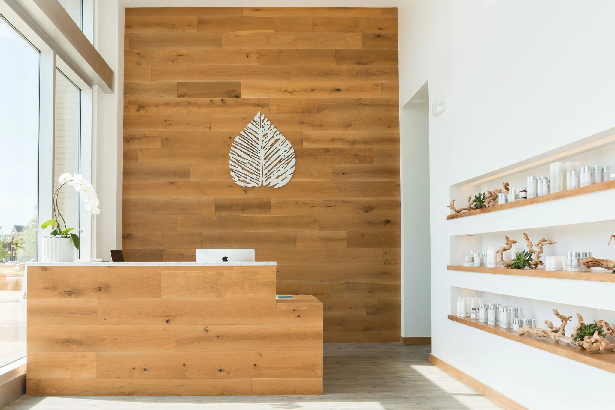
“Unit Skin Studio is a Dallas Botox & Dermatology Spa that takes an expert approach to skincare including Botox, ResurFX, Coolsculpting & Lip Injections.
Built to Feel Right.
The Challenge:
When Lindsey Pineyro came to us, Unit Skin Studio had all the makings of a standout, expert hands, an intimate space, and a discerning, high end clientele. What it didn’t have was a visual identity or content ecosystem that matched the experience.
This wasn’t just about aesthetics. It was about aligning the feel of the brand with the precision of the work.
The Insight:
Skin is personal. Luxury is subtle. And trust, especially in high touch spaces like this, isn’t bought. It’s felt. Every visual, every word, every asset had to radiate confidence without trying too hard. We weren’t just selling treatments. We were designing an experience people wanted to belong to.
The Execution:
We led creative direction from top to bottom, photography, styling, social sequencing, and tone. Every shoot was designed to match the studio’s minimal aesthetic, while still delivering conversion ready assets. From product upsells to client education content, we built a presence that felt equal parts clean, calm, and worth every dollar.
Brand Voice + Creative Direction
Studio Photography (Interiors, Treatments, Products)
Social Asset Planning + Execution
Product Photography for Upsells
Client Education Visuals
On Site Content Library for Team Use
Content Calendar Templates + Caption Guide
The Result:
The difference was immediate. Bookings rose. Product sales moved. Engagement climbed. The content not only brought new clients in, it gave existing clients more reasons to stay connected and spend. Unit became a staple in Dallas’ premium self care space, and eventually sold for profit. A clean, confident win.
Behind The Scenes Notes:
We shot live sessions with real clients, no actors.
Used natural morning and day light only, no strobes.
Built a white glove highlight reel for IG that became the studio’s most saved and shared post.
Created minimalist flat lay templates for product drops.
Quote:
”You gave the brand a feel that matched how we care for people. That’s what made it real.” — Lindsey Pineyro
“Every so often we get some down time. Like my Father, we enjoy staying busy, or working on our craft.
We teamed up with our friend, masseuse Christina Mesh to create some visual communication studies for a bridal package that Beauty Balance Esthetics recently launched. We love helping people when we can.
Also, you never know what doing something for someone else might lead to. Comprise is necessary for growth sometimes.
The Craft in the Quiet.
The Challenge:
Not every project starts with a pitch or a deadline. Sometimes, it starts with downtime. Beauty Balance Aesthetics had just launched a new bridal prep package, but needed visual clarity around it. They’d seen our work with Unit Med Spa and reached out.
It wasn’t a full scale campaign. But it was the kind of project we love: intimate, purposeful, and real.
The Insight:
Great creative isn’t always about the big idea. Sometimes it’s about showing up when no one else does, and creating something beautiful that didn’t exist before. We knew the bridal experience wasn’t just about the bride, it was about the environment. The tone. The preparation. Our visuals had to whisper, not shout.
We partnered with our friend and gifted masseuse, Christina Mesh, to stage and express that feeling.
The Execution:
The goal: a micro visual study that gave Beauty Balance Aesthetics usable assets for bridal marketing, both online and in consultation. We leaned into calm tones, tactile elements, and scenes that felt lived in and sacred. No commercial gloss, just authenticity, energy, and detail.
Visual Concepting for Bridal Package
On-Site Styling + Creative Direction
Massage + Preparation Sequence
Photography
Brand Tone + Caption Language Suggestions
Final Delivery: Still Image Set + IG Ready Videos
The Result:
The assets brought clarity and credibility to the new bridal offer. Christina’s presence in the imagery added depth and trust. Beauty Balance used the content to showcase the package both online and in person, increasing early adoption. Most of all, it reinforced the brand’s commitment to care.
And for us? It was a moment to sharpen the blade, and honor the belief that sometimes, giving is part of the growth.
Behind The Scenes Notes:
Shot mid week, off schedule, using studio downtime.
Used only available light and real linens.
The fragrance we used during the shoot became part of the brand’s client prep kit We didn’t just charge, we collaborated.
Quote: ”It wasn’t just the photos and videos. It was the spirit behind them. That’s what people felt.” — Christina Mesh
Not everything has to be big. Sometimes it just has to be right.
“The Body Labb is a cosmetic laboratory located in Oak Cliff that specializes in Skin, Body, & Face. It is sister to The Modd Labb, a hair and color salon.
Beauty in a New Light.
The Challenge:
Mod Labb had already made its name in Dallas. But Body Labb was something new, a full service studio focused on lashes, brows, makeup, spray tanning, and even massage therapies. No hair. No confusion. Just clean execution in a fresh space.
Jake Tafoya brought us in to help tell that story. She didn’t want just marketing, she wanted momentum. Something that would cement Body Labb as a go to in Oak Cliff & Dallas from day one.
The Insight:
Opening a new studio isn’t just about services, it’s about signal. We needed to make it clear this was a different lane for Mod Labb, while still carrying the same bold energy. The vibe had to say: premium, creative, unapologetically confident.
So we gave Body Labb a content system that matched that energy from the inside out.
The Execution:
We delivered full creative direction for launch and beyond, shooting visuals that could do more than just sit on a feed. We built the lookbook. We built the narrative. We helped shape how Body Labb would live in the digital world and grow its following in real life.
Launch Photography (Studio, Staff, Services)
Motion Content for IG Reels + Stories
Video Production for Brand + Booking
Social Content Calendar + Caption Strategy
Creative Direction for Marketing Material Ongoing Consulting for Brand Growth + Engagement
The Result:
The launch landed loud. Bookings filled up. The brand found its rhythm fast. Our visual work became the backbone of Body Labb’s content, creating consistency, traction, and immediate appeal. Jake was thrilled with the turnout and results. To this day, we still collaborate on ideas and projects.
Behind The Scenes Notes:
Shot all content inside the studio to show authenticity.
Used cinematic lighting for makeup services to elevate the perceived value.
Kept editing minimal, real skin tones, real energy.
First promo videos and photos generated 8x typical engagement.
Quote:
”You helped bring her to life. I couldn’t have done this without you.” — Jake Tafoya